Tuesday, 21 December 2010
Screen Printing Workshop
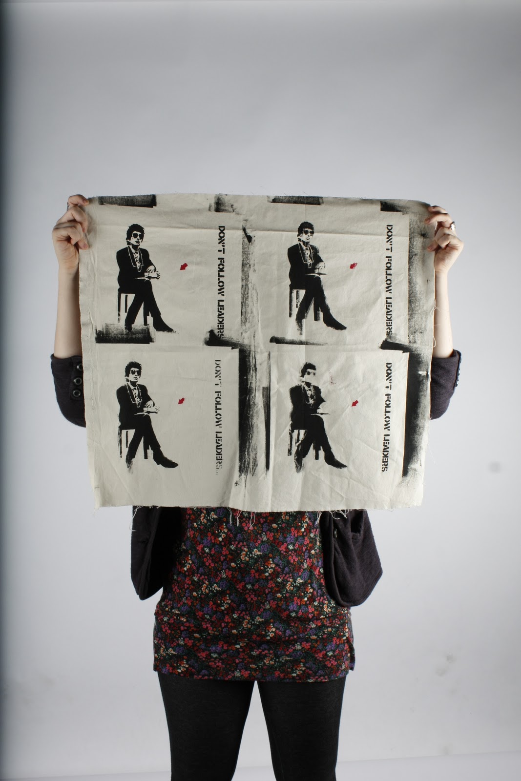
A few weeks ago, I went to a print screening workshop. I'd never done screen printing before, so the final outcome isn't brilliant but it shows Bob Dylan and 'Don't follow leaders'. This design is a street art piece by Jeff Aerosol. I found the whole process interesting and extremely enjoyable.

Sphere Designs | Branding project
This project was a branding project. Future Designs, a bespoke lighting company wanted to re-brand their company. We had to design a brand from scratch, present our ideas to the group as well as add our logo and brand onto applications such as vans, stationary, t-shirts etc. To present our final new brand, we had to arrange our work onto an A1 sheet and 'sell' this to the group.


Information Overload
The brief for this project was to produce a poster on what I had learnt in the Visual Expression 2 Lectures I had had.
We had to sum up what we had learnt, and only had one workshop session to complete this.

Oxymorons | Pictograms
This project was about pictograms and simplicity. Working in a team of two, we had to choose three oxymorons and produce six pictograms for each oxymoron. Between us, we had six different oxymorons and 36 different oxymoron designs to choose from.
I chose;


I chose;

Ill health

Holy war

Hells angels
Wednesday, 15 December 2010
Type Rules | Typography
For this project we were given a different typographic rule each. We had to produce two posters, one using just two colours and the other being completely free. I was given 'Thou shalt avoid rivers within justified text.'
Firstly, I looked up what 'rivers within justified text' are and the definition I found was; 'In typography, rivers, or rivers of white, are visually unattractive gaps appearing to run down a paragraph of text. They can occur with any spacing, though they are most noticeable with wide interword spaces caused by either full text justification or monospaced fonts.'
From this I produced two posters, using that definition.


News Article Poster
Each week, we were given a different news article poster that we had to interpret, and then show our opinion on the chosen subject. The poster was to be given in A2 format, though some posters were slightly bigger or smaller.
The first one was about churches being used to promote films, and filming. Nicolas Cage used Glastonbury Abbey to promote his latest film about black magic, sorcery and magicians. This cause a lot of uproar as people religious people argued that Glastonbury Abbey is a holy place and therefore should not be used to promote such films.


The first one was about churches being used to promote films, and filming. Nicolas Cage used Glastonbury Abbey to promote his latest film about black magic, sorcery and magicians. This cause a lot of uproar as people religious people argued that Glastonbury Abbey is a holy place and therefore should not be used to promote such films.

The week after, I was given another news article about TV being better for toddlers than books. A film such as 'Alice in Wonderland' engages young children and teaches them about relationships and how people relate to one another, as well as good vs bad. It also increases childrens' braincells. A child can loose interest in a book however, especially if parents are too tired to read in a fun, creative way.

Finally, in week three I was given a news article on David Cameron and his with drawl of child benefits, despite it not being on his manifesto. This caused a lot of anger between claimers and many people felt used and lied to.

'Don't believe a word'
The brief for this project was to choose a quote, interpret it and then create something 3D. I chose 'Don't believe a word'.
A lot of people rely on star signs, fortunes, people telling them what to do and often what they can or can't achieve. I thought about the different things people are told and from this how it affects their life.
Instead of having fortune cookies with pieces of paper with fortunes written on, I have left the pieces of paper blank and have hung them from the empty fortune cookie shells. The idea is to replace pre-written fortunes, star signs, and negative comments from people in day to day life and instead take opportunities and create your own fortune. Life is simply what you make it.
Credit goes to Daniel Haigh, David Buckley and Andrew Harvey for helping me put this together.


Newton Press Ltd
In summer, I did a few days work experience with a brilliant printing company named Newton Press Ltd . I worked with some wonderful people and I chose to collate the information I learnt there into a magazine layout. I learnt about numerous different printing machines and the process from initial client inquiry, the database, to the graphic designers and finally to the finished product whether that was leaflets, booklets, business cards, large banners or even posters and much more.


Thank you to everyone at Newton Press Ltd. It was a pleasure to work with you all.
Creative Journey
For the end of my first year, my tutors asked me to produce two documents which express the creative journey that I had taken that year. These two spreads are what I produced.
The first is a diary entry from a trip that I took to San Francisco, USA and the the other is a spread that I produced about photography and graphic design.


The first is a diary entry from a trip that I took to San Francisco, USA and the the other is a spread that I produced about photography and graphic design.


Tuesday, 14 December 2010
Typographic Journey
This is a project that I completed last year. We had to use only three colours, hand rendered, to show a journey that we'd either like to do or have done. We could only use typography as image, and no pictures. For this, I chose a trip to Japan and how it would be. I had a lot of fun creating this piece.


Subscribe to:
Posts (Atom)